|
Mon, Nov 7, 2011 at 11:08:24 PM
#1
|
|
banned

Joined Tue, Jun 14, 2011
 This user is offline |
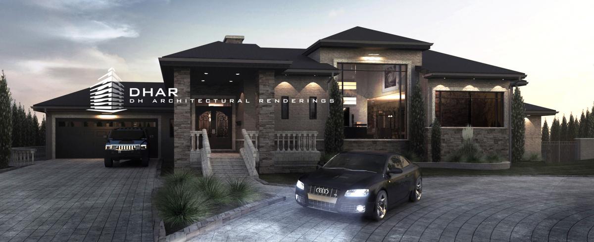
too much glass on that window..
|
 |
|
Mon, Nov 7, 2011 at 11:33:22 PM
#2
|
|
active
Joined Tue, Aug 25, 2009
 This user is offline |
obviously this is beautiful...
|
 |
|
Tue, Nov 8, 2011 at 12:27:15 AM
#3
|
|
active

Joined Thu, Aug 14, 2008
 This user is offline |
great job
|
 |
|
Tue, Nov 8, 2011 at 1:48:44 AM
#4
|
|
banned

Joined Tue, Jun 14, 2011
 This user is offline |
the model itself is pretty good..
|
 |
|
Tue, Nov 8, 2011 at 4:15:45 AM
#5
|
|
active
Joined Sat, Dec 29, 2007
 This user is offline |
awsome glass window 
|
 |
|
Tue, Nov 8, 2011 at 8:02:44 AM
#6
|
|
active
Joined Thu, Nov 15, 2007
 This user is offline |
What did you use for rendering (MAXWELL or 3ds max)?
|
 |
|
Tue, Nov 8, 2011 at 9:56:06 AM
#7
|
|
active
Joined Tue, Feb 28, 2006
 This user is offline |
Pretty good rendering. The scallops the exterior down lights make on the exterior wall are a little harsh. Needs a softer edge or fade. Also, the exterior of the house is too dark and is difficult to see the nice detailing. I would do two renderings (one a day with no lights on and the other a night shot with lights on and overlay them in photoshop). This will allow you to lighten up the areas that are too dark.
|
 |
|
Tue, Nov 8, 2011 at 12:50:59 PM
#8
|
|
active
Joined Mon, Apr 5, 2010
No rating This user is offline |
WOW!!!!
|
 |
|
Wed, Nov 9, 2011 at 4:09:15 AM
#9
|
|
banned

Joined Wed, Nov 9, 2011
 This user is offline |
this house would look good however it was rendered..
|
 |
|
Fri, Nov 11, 2011 at 5:21:23 PM
#10
|
|
active
Joined Mon, Aug 10, 2009
 This user is offline |
Thanks, all. The glass is pretty large, but it is what was needed. Modeling and rendering was all done in Revit, then edited in Photoshop. As for the downlights, I agree with you, but I was limited to the tweaking of lighting and effects found in Revit.
Also, the project was originally rendered a bit brighter. The shadows were intentionally added in Photoshop to give it that desired final effect. Instead of adding excess light and trying to show every square inch of the building, I wanted to illustrate what the building would look like in reality. I have used that overlay technique you speak of, but was not required for this project. But still, I appreciate the input.
|
 |
|
Sat, Nov 12, 2011 at 5:58:09 AM
#11
|
|
active
Joined Fri, May 6, 2011
No rating This user is offline |
This is an excellent render it look to good to be done on Revit, how have you achieved the after effect on Photoshop any actions/filters you can reccomend to replicate this ambiance?
|
 |
|
Wed, Nov 16, 2011 at 11:44:49 PM
#12
|
|
active
Joined Wed, Nov 16, 2011
No rating This user is offline |
great job..
anyway,how to set up the lighting? thankyou 
|
 |
|
Thu, Nov 17, 2011 at 3:49:02 PM
#13
|
|
active

Joined Mon, May 23, 2011
 This user is offline |
man perfect as always looks awesome. Like the design and cladding looks good. The Audi with its the head lights just tops it off. Well done.
|
 |
|
Mon, Nov 21, 2011 at 8:04:26 PM
#14
|
|
active

Joined Mon, May 23, 2011
 This user is offline |
would love to see what you can do with revit only no CS4 (as I use revit only)
|
 |
|
Wed, Nov 30, 2011 at 5:35:38 PM
#15
|
|
active
Joined Mon, Aug 10, 2009
 This user is offline |
@jamie351: just posted the exported image directly from Revit
|
 |


